Banner Sponsors


For artists and collectors sponsored by Intercal...your mohair supplier and Johnna's Mohair Store
 bingle bears
I've just finished my website and I could really use some constructive criticism. Be bold! Be harsh! Tear it apart! REALLY!! I trust the wonderful people on this forum, so I know any negative criticism will be given for my best interests. So, go for it!
Thank you all SO much!
Heaps of Hugs,
Cheryl
 Back Road Bears
I think it looks wonderful! Very easy to navigate, not a lot of "fluff" to get bogged down in, great pictures and enjoyable to read. 
I'm not a fan of large text to be honest but found I was always using large text on my site too... most professionally designed websites don't use such big text... look at TT or Intercal or eBay or Etsy! Those who have trouble seeing tiny print usually have the text size on their monitors adjusted. Using smaller text size means less scrolling for the viewer and allows more info to be seen on the screen when the page comes up. Just a little tidbit of design info.
bingle bearsGood point, Dapne! Thanks! I'll head over and work on the size of my text now!
Heaps of Hugs,
Cheryl
I really like it, too, Cheryl.
The text size is just right for me and my monitor, but Dapne's point is a good one -- especially with more people using netbooks and other portable devices. (The text on my site is on the large side, too.)
My only comment is that I like to have a navigation menu down the left side as well as across the top (if that's possible).
Becky
Back Road BearsBecky - I had my navigation bar across the top on my site for the longest time too. I just redesigned my site this week and put it back on the left side. I think we're creatures of habit.  However I'm noticing a lot of retail sites now place the navigation bar across the top.... might be the new way of things and we'll have to adjust! LOL!
 The Littlest Thistle
It all depends on how many menu options you want to have - horizontal ones allow far less than vertical ones, for obvious space reasons! So I guess work out what all you want to have in the menus and go from there.
bingle bearsThanks all! I adjusted the size of the text and I think it looks better. What do you think?
That's a great idea, Becky. Unfortunately I'm using a free website without adds (Yola.com) so there are fewer choices. I played around with a LOT of backgrounds. And this one worked the best overall for now considering banner size, text that automatically has to be used in the banner, colors, etc. I'm a little concerned that it looks a bit plain.
Heaps of Hugs,
Cheryl
Back Road BearsLooks great Cheryl!
 Emo Bears
Looks good I think you should mention your recent fame with Alfie - that way you can link him, and you with being professionally printed. 
bingle bearsOh, I hadn't thought of that Julia! What a good idea! I'm going to think about how I'd like to add that.
Thanks!
Heaps of Hugs,
Cheryl
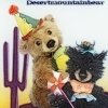 desertmountainbear
Hi Cheryl, Your website looks great. I also use Yola free Yola, I love them, easy to use. I like the bar across the top but I do have my bar down the side. I have also used blog backgrounds to change things up. You will find as you get more comfortable with it there are lots of way to customize it.
Joanne
ps I really like the background you have used on the homepage. I think the color looks just great with the banner image/
 Holt, MI
I don't know if this has been said... but seeing text first left aligned and then right aligned right under it looks strange to me... so I'd kind of like to see the first two lines of text (title and menu) centered. (I think because everything else on the page is centered too...)
I LOVE IT though... I need to work on my website 
 Laurie Lou Bears
I love the website Cheryl 
Laurie :hug:
The Littlest ThistleHad a bit more chance to look now, was running through before. Well I agree that I'd prefer the menus lining up under the header, it does make you a little cross-eyed with the left/right alignment 
You should definitely mention you recent publicity with Alfie, and have a good big picture on the front page below the text but above the 'visit my blog' line.
Otherwise, it looks great
 Pennsylvania
The site is nice. It is clean, easy to navigate and very no-nonsense.
Clearly a template but that's just fine because the other things outweigh.
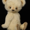
The only thing I could suggest for improvement is the picture of the Bear at the top of the pages. It's a little close-up. It's hard to tell if he's a Bear or some other kind of animal. If the visitor knows he's coming to a Teddy Bear website, the picture will be recognized but a naive visitor might not understand that he's looking at a Bear until he reads or looks around for a minute.
Other than that, it looks good.
Hi Cheryl,
I like your website. It is clean, informative and easy to navigate.
Marion
Back Road Bears... seeing text first left aligned and then right aligned right under it looks strange to me... so I'd kind of like to see the first two lines of text (title and menu) centered. (I think because everything else on the page is centered too...)
See, I like that. What then makes me go cross-eyed I guess, now that I'm really studying it, is that then the "Welcome to Bingle Bears...." text in the body is left justified. The text in the body of the rest of your pages is center justified so perhaps the text on your home page should be too? That would balance out the banner text and navigation bar.... IMO!!
Some of all this is just going to be personal preference! LOL! 
well done on your website, it was nice and simple to use!!
Holt, MI... seeing text first left aligned and then right aligned right under it looks strange to me... so I'd kind of like to see the first two lines of text (title and menu) centered. (I think because everything else on the page is centered too...)
See, I like that. What then makes me go cross-eyed I guess, now that I'm really studying it, is that then the "Welcome to Bingle Bears...." text in the body is left justified. The text in the body of the rest of your pages is center justified so perhaps the text on your home page should be too? That would balance out the banner text and navigation bar.... IMO!!
Some of all this is just going to be personal preference! LOL! :P
I went back and looked at it some more... and actually, the menu text where it is isn't what throws me off... it's the weight of the Header (Bingle Bears by Cheryl Hutchinson) against the weight of the main, centered bear image. It feels like it's soooooooooo close to, but not quite yet, balanced. XD
And of course... like you said, it's all personal preference.
The site is lovely as it is right now
Oh, and I also think the fame of Alfie should be mentioned
bingle bearsYea, Heather, I agree that the text in the header is not quite there--but unfortunately I can't change the text, color, or size of those letters. Ahhhh, the challenges of using a free website--but--it's FREE. So I guess it might have to work for the time being. We'll see.
Heaps of Hugs,
Cheryl
Hi Cheryl,
I think your site is great as it is! It's easy to navigate & has all the information you need... I have to ask what "make" Bingley is? I have a Lhasa Apso & a Shih tzu but we used to have a Tibetan Terrier too & I can't make out which make he fits into?!
Luv & Hugs,
Julia x
bingle bearsHi Julia! Thanks for your comments about my website. Bingley is a ShihTzu and Poodle mix. Some call his "make" a Shihpoo or Shihapoo. But basically he's just a glorified mutt! My eldest daughter and my husband are severely allergic to dogs (even more so than cats!), so that is why we chose him. They don't have any problems with him.
Heaps of Hugs,
Cheryl
 Honey Valley Bears
Hi Cheryl
The website looks great. It is simple and to the point. I love the fact that your first page has a sign up for your mailing list. Great way to encourage people to join. My only recommendation would be on the pages were you have it set up so people can email you perhaps in the bottom corner or somewhere on the page actually put the email address. Some people may want to send an email but at a later time. From experience there are a lot of people out there that don't like the webbased format. By adding your address at the bottom your giving them a chance to contact you later or in a more comfortable form. But having the web set up works for others and some people like to just type right away and be done with it. Giving both options will cover everyone. As a graphic designer I usually suggest to people that they do both if they are comfortable with it. Some have a reason for only wanting the one option, but the idea is to reach as many people as possible and make it easy and comfortable for you customers.
Amber
Hi Cheryl,
Your website is great ... easy to navigate and I enjoyed my visit. Thank you
Hugs
Carolyn
 Bumpkin Bears
I really like it, easy to navigate, lovely clear appealing photos of your Bears. What I loved the most was your intro text about what your Grandma said, my Granny said just the same about me due to being small It really added character and a homely feel to your site, which is after all what we want to create with Bears
Christmas Hugs
Catherine x