Banner Sponsors


For artists and collectors sponsored by Intercal...your mohair supplier and Johnna's Mohair Store
 Creative Design Studio (RKR4CDS)
Hi all,
It's been a very long process - over a year - but my website is beginning to be overhauled. I'm in a quandary and would like the opinions of those who know about search engines. I was under the impression that the keywords and meta tags from the whole site are what gets picked up on; my webbie is giving me the impression that it's the Home page contents that make the difference.
He's begun to formulate the site so that I can drop in the images and info and control the content from my computer.
Here's the problem: As I was reviewing the first page or 2 that he's begun, I was thinking that he'd done the About Us page - he says it's the Home page.
My vision of a Home page is very simple - one of the header bars (one of 5 vendor banners Shelli created), my logo bear's image and the company name. And an Enter button access into the site.
All Fine Art/Artist sites I've viewed and admired are quite stark - very little info beyond what I list above. A lot of them are on black or very dark backgrounds; I wasn't going that far but I'm unhappy with the current choice. I'm willing to accept the knowledge of someone if this is actually the truth about how the search engines work, but...
Me: I'd like the Home page to be as uncluttered as possible:
site name in header banner,
logo pic and
company name.
This is the About Us page you're showing me, right?
Webbie:
No, that is the home page ... if I do it as you explained, you will get virtually nil search engine listings ... the most important factor in getting good SE rankings is text content, and even though what is currently on the home page is only minimal, it is better than just doing what you want.
I don't feel the stuff on the page is 'minimal' - it's far too text-rich and has absolutely NO impact. Rather messy looking and unfocussed....
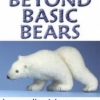
Here's the url: can you please look at this and give opinions on how the engines work?
http://www.beyondbasicbears.com/
TIA!! - I'm NOT looking for "How cute" "Can't wait to see the rest" "etc..."
Just please tell me if I'll have the same results if I stick to my image of how I picture the site or follow another's advice. I'm not very avant garde but hate looking run-of-the-mill more!
Hi Bobbie
Your web person is wrong - you do not need your "about me" information on the front page. You do need tags there though - and your webbie is confusing the issue between the two.
Metatags are part of the html code that makes up your webpage - they are inserted into the "head" of your page and are not visible when someone is browsing your page. They ARE visible to the search engines that crawl out and try to index your page - so it is important to have good tags on the front page of your website.
I'm not going to explain this well -Shelli will be able to jump on and do it better  but basically the tags should reflect what you think people might type into the search engine - so for example you might have bear kitsets, needlefelting, bear making supplies, miniature bears
At the moment I have a simple wysiwyg website and I can't do the coding for that section myself, so I cant show you what my tags actually look like - but if you go to one of those websites you admire and look at their source code (by clicking on "view" in your menu and source code our page source in the drop down bar) you will see in the header code something that looks like
<head>
<title>Honeythorpe Bears</title>
<meta name="keywords" content="artist, miniature bears, collector bears, bears for sale, ooak bears, honeythorpe">
 I would use better keywords than this but it gives you an idea
You can have your front page as clean and simple in appearance as you like - as long as the metatags are encoded into the html in the head of your page, the search engines will be able to read them.
I agree with you - I like clean pages and I honestly don't want to read several screens worth of information about an artists until I've seen their bears. At the same time, whilst I like clever arty introductions on non bear sites - I hate having to click through a couple of pages just to get to a bear artists current work - time is precious and there is a lot of choice out there. Don't make your current offerings more than a click away from your homepage or you'll lose people's interest just as quickly.
I do like your critter of the day feature - I think it's a really neat way of attracting people's attention to new content. If anything I would suggest that you make your menu at the top of the page bigger - these are what you want people to be clicking on to go further into your site, so make them visible and easy to read and use.
 ToadBriar
what's your most favorite gorgeous most impressive piece of work - or your top
three? put em up there prominently! Take up at least 1/3 of the space with art.
Don't make people click through pages to find out if they like your art or not!
Your site is like Playboy, we're not looking at it for the articles :crackup:
I see a sheep & totebag but they're a tiny piece of 'real estate' on what is
essentially an art site - right? Gimme art & blow me away with it!
almost 1/4 of the page is the form to join the members club - asking for a lot of info, too, with 'sensitive' info
like street address & all. Heck I'm usually too paranoid to sign up just for email newsletters because of spam.
But there's nothing to convince me WHY I'd want to join or what the club is. Convince me it's worth it! As it
is, it's taking up a big chunk of your page & I dunno why I'd join - so maybe you'd be better served with a
bold text link that says 'Sign up for members club for contests, discounts, etc' or whatever it is the club entails.
then link it to a page all about the club where you have the room to properly give detailed info.
I see Webbie's point - the days of hiding keywords in meta tags is past, sadly. So yeah, page content
is important to google et al.
BUT you gotta maximize what you're offering. What's there now is very detailed mini-bio. But
if I had seen your stuff & forgotten your name & wanted to find your site, I would search words like
'needlefelting', 'felt', 'wool' 'felting kits' 'polar bears' etc. & these words aren't there. You are going to
get hits for "knitting, crochet, tatting, lace making and needlework" but that stuff is not really relevant
to the site. I suggest thinking of all the keywords that apply to your work, & work them into a smaller
paragraph or two - for instance, keywords bolded:
Bobbie Ripperger has been a teddy bear artist for 15 years, creating original heirloom quality bears from the finest of materials such as mohair, alpaca, and wool felt. Specializing in the new technique of needlefelting, Bobbie uses special barbed needles to create felted wool soft sculptures. Her polar bears in particular have earned such honors as Blah Blah Blah Bear Award, and Other Famous Teddy Award. Her work has been featured in Thus and Such Bear Magazine. In addition to creating, she also offers courses in needlefelting as well as original patterns, and complete kits which include wool roving or batt and felting needles.
Do you see what I mean? Think of it backwards: "people searching for me will use these words." OR, "I want people
searching for needlefelting teddy bear artists (or whatever) to find MY site." & choose what words you will use,
accordingly.
does that make sense? It's a great About Me page but I think an index page needs to be
punchier with eye candy. But then, I am the MTV generation
 Canna Bear Paint
You are correct. There is too much on the home page, and there is no good reason to include all that text on it. That text belongs on another page in your site.
META tags, interestingly enough, are soon to be completely obsolete. Search engines stopped relying on them in recent years, and I think only one "known" crawler (Inktomi) even takes them into consideration at all when ranking a site today. Google never really used them (and given the success of Google, all of their competitors rushed to change the way their engines worked to match them). So yes, have your META tags. But they aren't important to your ranking anymore. The content is of the utmost importance, and certainly not just on your home page. The home page is not some magical entity that has 100x more importance than every other page. Sorry, webbie! (And don't let him talk you into 1-pixel tables or white-on-white text either, search engines are wise to those now, too!)
Cheers,
Kelly
 Miss Dorothy's TeddyFolk
What a treasure trove of good ideas! 
thanks Bobbie for bringing up the subject. I agree with the others, all that text; my eyes glazed over a bit 
I would think that needs to on the About Page, yes?
Dorothy
 Jellybelly Bears
geez, i didn't know that meta tags were out! wow 
Canna Bear Paintgeez, i didn't know that meta tags were out! wow :wacko:
Isn't that crazy? Just heard about that the other day myself. What happened to the days of "META tags are everything! All hail the META tags!". Huh. I blinked and they changed the rules on me.

Kelly
ToadBriarJellybelly Bears wrote:geez, i didn't know that meta tags were out! wow :wacko:
Isn't that crazy? Just heard about that the other day myself. What happened to the days of "META tags are everything! All hail the META tags!". Huh. I blinked and they changed the rules on me.
Kelly
I know, it was so convenient. I imagine people who earned money per click-through abused it by loading
up on irrelevant keywords just to get traffic. I know I hate to look something up only to find the results are
all just stupid junk sites with the entire dictionary in their keywords.
Maybe I should look up less obscure stuff :crackup:
Posts: 3,177Hi Bobbie,
I don't like any clutter on my intro page as i think it is important to make visitors want to go further - i have visited so many sites that have their page so full of stuff that i really can't be bothered to look as other pages.
I think, and this is just my opinion Bobbie, that your page is way too cluttered. The way i get around the search engine thing is to add a small portion of text describing the latest additions to my site - apparently search engines love new content, if you keep your page static the search engines get fed up with it and pass you over. You know, you are never going to be big on the search engines no matter how you try, there is simply too much on the web...............just do enough so that you do show up in searches Bobbie.
This is my 'front page' click here and it is as plain as i can get it but with enough graphic content to set the tone for the rest of the site.
If you are seriously not happy with your page as it is don't accept it - it's your site and it represents you Bobbie - get the guy to change it until you are happy with it.
Let us know how you get on
Penny 
Jellybelly BearsI didn't know that either Penny about changing the front page...lots to learn still for me I see!!
I can make really pretty banners and graphic elements, but I don't know much about site programming per se... so don't rely on me for insights on html or metatags or site design. I bow to the masters on that one.
I do have the capacity to form an opinion, though, and I agree with most of what's been said here, Bobbie; I think the main page of your site is too text driven, and that there aren't enough "boxes" or "categories" which separate all those words into neat little parcels, making them easier to scan and digest. Entirely overwhelming.
I also think there needs to be a lot more done, in terms of color or graphical punch added, although you're off to a super start with that GREAT masthead banner! (Laughing here...!) Put simply, there's waaaaaaaaaaaaaaaay too much "white space" on that home page of yours. And I don't just mean the COLOR white. White can actually be a beautiful website backdrop (*see the site I recommend below.) In this case, though, the white background doesn't appear to be part of a larger "design concept" as much as just a plain backdrop chosen without thought to composition or impact.
Simple is always terrific when it comes to websites -- makes things easy for your visitors when there's less color clutter, in most cases -- but simple doesn't have to mean "white" or "plain" which I think your in-development page verges on right now.
One of my FAVORITE websites is for a glass bead maker (Sarah Hornik, GLASS BY SARAH) who, interestingly, used to do web design. She won't do your site design for you (apparently she's entirely burnt out on web design and has retired from all that), but her glass bead site CAN be a great model for how to pack a lot of information -- in abbreviated, not COMPLETE, form -- onto your home page. I find her site really motivates me to "look further", while providing me with lots of pretty and interesting eye candy all on its own.
Do check her out for some ideas on how to beautifully present a truckload of important information in a really easy to digest way. You'll see that her home page is just littered with information... yet all of it is beautifully presented, in tiny little blurbs, surrounded by boxes or dotted lines which separate one "clump" of content from the next. A great info-rich page design (I think, anyway.)
Creative Design Studio (RKR4CDS) This is what I originally asked the webbie for, last spring. Too much time has elapsed .. and a lot of material has been overlooked.... very frustrating. At least I've pd only half down.
I had totally missed the meta tags that're in place. He simply took the ones posted for my old site (sewn bears) and didn't update to reflect everything new in my work. I feel as if I have to build the whole model over again (you guessed it - cannot find my copy of the 2 disks I sent him.... story of my life) I don't think I was destined to have a site; I've been at it for 8 years, 6 different webbies and not a single one has produced results = a completely functional site.
I'm determined though and this WILL happen.
I cannot Thank You all enough for affirming what I've known in my heart that I wanted.
What I got was a format just like he's done for most other artists he's designed for; I'm gonna be the thing the burr under his saddle....
I've sent him (yet another) email listing all of the changes I need along with a fair amount of the quotes (no names or IDs!!)
TY TY TY!!!!
Not sure the image will upload as it's not showing up in Preview - it's been too long since I've done this..
And once again, (back of hand to forehead) my excuse is "I'm on drugs..."
Creative Design Studio (RKR4CDS)I've just gotten a Reply - so this may happen yet!!
Yes, I can do all of that for you (as much as I disagree with it) ... the only problem will be the navigation buttons in the catalog section ... because the side menu has to be taken up with the dynamically created catalog menu items, I will have to leave the main menu bar across the top in this section only ... this OK?
Also, if I replace the catalog menu buttons with text, because you want the items in a non-alphabetical order, they will show up as 001 Beginner, 002 Intermediate etc, as I have to place the numbers before the name to get them to line up in the order you want.
I've given the OK for this one page.
 Back Road Bears
This guy sounds like a jerk. Sorry but his "as much as I disagree with it" comment was so unprofessional and it sounds like his need to format is a certain way so things will show in the proper order is just plain laziness.
I'm no web design wizard.... my knowledge is limited, I don't know much about HTML and am glad that META tags are 'out' cause I don't know what the heck they are!!!!! BUT..... I get 20+ hits a day to my site, many through Google and related search engines. I don't pay to get listed in them, but my home page contains all those keywords, I don't use graphics containing those words, they are typed words that show in HTML as words, not a graphic. I think this makes a difference too in search engines finding you. Now, I hate my website.... my web design skills have come a long way since I designed my site but I don't have time for an overhaul so please don't go visiting my site for an example of how to do a home page.
But, Bobbie, as it's been said, don't accept anything you aren't happy with. Don't give this guy another penny until you are 100% satisfied! I can't believe he's designed other artist sites. Like the others, I agree there are way too many words on your home page. Artists are VISUAL people.... and those looking to buy our art want to SEE it... not read about it! And there should be just enough on your home page and grab one's attention and bring them in to your site further. Then let that visitor decide if they want to read about you, your classes, your bears, your kits, etc.
I love the site that Shelli provided a link to. Very artistic and classy. Lots of eye candy!
Good luck, Bobbie!!!
Canna Bear PaintWell, glad he will work with you (grudgingly though, it seems!). Did I go to school with this guy? 
Cheers,
Kelly
ToadBriarI concur with Daphne's assessment of this dude.... 
Does he give any reason for why he thinks his idea is better design?
jeez louise. just cos someone learns HTML doesn't automagically give them design skillz.
stick to your guns Bobbie, your original idea is gorgeous.
do you think you might be better served by buckling down to just learn to make the site
yourself? It's dead easy with a nice editing program like Dreamweaver.
easier than learning to knit, by far :crackup: :crackup: :crackup:
Jellybelly BearsGeez Bobby...I agree with Daphne and Kim...Can we see examples of this guys work? He should be in this to please you not think that his opinion is right beyond all else!
I also have to agree with Kim on learning Dreamweaver or Frontpage. It is really easy and you learn little by little and it is so good to have things the way you want them and be in control!! It doesn't take a huge amount of time once you've got your basics down...sounds like you're spending all that time with this guy anyway! And you have your design down already..that is the biggest challenge.
I'm not sure about dreamweaver, but with frontpage you don't actually need to know html...you do learn it through building your site, but its not needed at first.
Also, Daphne good point about graphics...search engines will only look for words, not words pasted in on graphics...I never thought of that before. They would see it as a picture wouldn't they..
I submit my site to search engines...do you not have to do that then??
Bobbie, I do hope you get what you are after...and thanks for bringing this discussion out too...we should all talk web sites more! its good to learn
Back Road BearsI'm not sure about dreamweaver, but with frontpage you don't actually need to know html...you do learn it through building your site, but its not needed at first.
Yup, I use Frontpage and that's how I've learned what little I do know about html. With Frontpage it's sort of a WYSIWYG type program but also allows you to see, write and edit the html so it's a great way to design in the visual and then be able to see how it looks in html.
The girls are right... with all the time you are spending on your website you could spend the time learning to do it yourself and be in conrtol of it!
Posts: 3,177Your design for the front page looks far far better than the one your web guy produced Bobbie.......go for it!
Ahhhhh HTML.............what a delight, what a joy to use, what a way to end up in the nuthouse :crackup: I still use good old 'notepad' for my html coding - i must drag myself into the 21st century ha ha ha - hate Dreamweaver, by the time i learned to use it i would be old and grey.........oh hang on a minute, i am!
Penny
 Hearts Ease Bears
I agree and would add if you're not happy do it yourself! thats so much less stressful than trying to get people to do what you want.. i wanted a more personal site with MY vision of how it should look and then i was responsible for the changing content and not having to argue ever about billing etc..i use a prpgram similar to Daphnes' only cheaper! its called web easey and its by VCOM..they have several versions..the older ones are quite cheap now..the newest is now $25 thru their website...and they offer hosting also. good luck and have fun! deb
 Baird'sBears
 This is a very informative and much needed (by me) thread :dance:
I had no idea that metatags were out, or that changing content helps draw attention to a site.
My daughter got my site started, but I can easily maintain it through
www.Bravenet. comMy problem lately is finding time to make new critters 
Nancy Tilberg's Business of Bears course recommended Bravenet, and it's great for a beginner . . . especially if you don't want to learn too much too soon!
Bobbi, if you're paying this guy, take no excuses!!! What does he know about selling bears, anyway?
 Flying Fur Studios
Bobbie, hope this all works out for you. I'm a little late jumping in.
But this guy does sound like a jerk. I could take that 1st page your designed and in an hour or so, make it a webpage, EXACTLY how you want it. I don't know what this guy was talking about.
let me know if you want me to do that page for you, I'll work for trades..........lol
PS. I just use photoshop and dreamweaver to make webpages. It took a while to learn, but was so totally worth it.
Miss Dorothy's TeddyFolkBobbie is your webbie's name Dave?
It sure sounds like him.
Dorothy
Creative Design Studio (RKR4CDS)Uuuuuuuuummmmmmmm...... .. ... (whistling tunelessly....scuffing toes.....looking skyward...) I avoiding naming names. Those who recognize the business name would know; you're apparently one who does!
His wife is a bearmaker; he's an Australian journalist and does webwork as a second busuiness, maintaining & creating many (hundreds of) sites. One of my best buds in OZ uses him and her site is one of the few in his long list that is more along the lines of what I want.
When I put out a query on a number of the bear lists about a year ago, looking for a new webbie, he was one of the few that responded, replied in a timely manner and he had a very business-like, up-front approach, quoting a reasonable amount of money for the number of pages I need created (12 - 15, complete with shopping cart). I want a site that I can totally maintain, but going a bit beyond Front Page and a few of the wysiwyg programs.
It's slowly being turned into what I had in mind - I realize now that part of the responsibilty was mine. I gave him most of the pix, banners, text etc in April/May, but never designed an actual page template to show him how I'd like it to appear. He's not expected to be a mind-reader, so while on the surface I can agree with some of the negative comments, it's not entirely his fault.
I hold that the long time lag between discussing this last winter/spring and when the actual work began a month ago is where he dropped the ball. I hope he's kept all of my emails but I feel that I've had to do a lot of the work twice (then & now) and out of a list of 5- 8 points (change to all-white backgrounds, at least one item on each page given a drop shadow, dk brown text, etc...etc...) at least one of the points are overlooked and I must remind him again. That can sure seem like nagging, but I'm a nit-picker... and WILL keep at it until it's what I envision.
He's got the individual logos, templates, etc.. now. I still wish I had the time & energy to thank each of you individually; you gave me the 'courage' to stick to my guns. I cannot alienate or put-the-back up of someone that I need to represent me before the world so I wanted to do this in a non-prickly way.
You're the BEST!!!