Banner Sponsors


For artists and collectors sponsored by Intercal...your mohair supplier and Johnna's Mohair Store
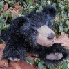
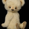 bingle bears
Well, I've finished my website (I think), and I'm ready for LOTS of constructive criticim. Remember the rule! Be BOLD, be BRUTAL! I can take it! www.binglebears.net All of your comments during the first round of comments on my website has really made my website better than I could have even imagined!
Oh and I would LOVE to exchange links with people who are intereseted.
Thank you SO much!
Cheryl
 The Littlest Thistle
Okay, well the left hand links menu is quite far in, and could you possibly make the text on the buttons bold, as the swirls at the top and bottom stand out more.
On the 'Home' page, rather than having a 'Click to e-mail me' line, you could just have the link on the line 'I'd love to hear from you', or have it, 'I'd love to hear from you, please e-mail me' as it's a bit disjointed reading it that way.
On the 'Gallery', can you make the background transparent for the pics to sit on top of the background, rather than adding the mottling, they don't quite match right now due to the texture and colour changes on the main background.
On the 'Patterns' page you could include a photo of one of your elehumps as a preview of forthcoming attractions. You also should have a mirrored bear sillouhette like on your other pages.
On your 'About Me' page the text is randomly different colours on different paragraphs, one even changes part way through, could it all be the same colour?
On the 'Comments' page (which are lovely btw) the text colour of the contributors is a little too close to the background colour, 'Beth in New York:' just hits a darker patch on the background, making it harder to read. You could also include a note at the top that these are from previous customers.
'Policies' should perhaps be renamed 'Pricing and Shipping Policies' as it's not clear from the button that these are the details that will be included within. Given that that would be an enormous button, maybe just have 'Pricing Policies' on the button?
Sorry, that was probably quite blunt, I'm afraid as I work as a software tester, my job is to examine things such as websites from the customer's point of view :redface: If you wish, you may feel free to tear mine apart when I put it up in a few weeks time!
bingle bearsThanks Katy!
--I'm using a free Yola platform (a very simple one so that I could add details), so I unfortunately can't move the buttons further to the left. I made the buttons in Photoshop, so I might be able to make the text bolder. I'll work on that.
--I'll work on rewriting the Homepage sentences regarding emailing me.
--Regarding the Gallery, I know the background of the photos doesn't match the main background. I had wanted it to be transparent--and it IS in photoshop. But as soon as the photo and frame is put into JPeg formatting, the background turns all white and just looks too stark against the background. I COULD add a small black frame at the edges so that the mismatched background isn't so noticable. Do you think that would help?
--That's a great idea to include a photo of one of my elephumps on the Patterns page.
--I don't know why your monitor shows the "About Me" text in different colors. It should be all black except for the links to my email and my blog (which are a brown color). At least that's how it is coded and how it shows up on our two monitors here. Anybody else having multiple colors on this page?
--I'll see what I can do about the text color on the "Comments" page and adding a statement that these are from my customers. I just noticed that the header mentions that these are "comments from my wonderful collectors." I'm concerned that adding a sentence about it would be redundant.
--I wasn't happy with just "Policies" either, but there isn't enough room for more than two short words. Other wise the text on the button is just too small to read.
Thank you so much, Katy! You've given me so much good advice. I really appreciate it!
Heaps of Hugs,
Cheryl
i think your website is beautiful,very elegant ,makes me think i need to work more on mine  i'd be happy to exchange links,
hugs sandra
The website is wonderful, in my non-professional opinion.
- I like the menu bar on the left, and I know how it is with website templates -- they don't let you adjust everything.
- Your "About Me" page has regular black text on my monitor, and your gallery is beautiful! (Since you don't have any new bears available right now, why not invite people to join your mailing list so that you can let them know when you have some?)
- Your Picasso bear continues to be a joy to me every time I see it/them! All I can think of is my art history courses at the university, and how the bears capture Picasso's artistic innovations while adding hilarity (something that Picasso didn't seem to have that much of).
- I'd love to exchange links with you! (I'm adding yours to my website right now.)
Becky
Hello Cheryl,
I think your website looks lovely personally! I think if you were to really "study" anyones website, there would always be something that you think could be "done better" etc, but I think sometimes things can be over worked. When I first went onto your site, I found myself thinking how lovely it was actually, and I love your bears.
With regard to your problem relating to the transparent backgrounds to your pictures, try saving them in .png format in Photoshop (which is what I use for transparent backgrounds) and that may solve the problem. I know I have problems sometimes if I have merged layers for example, but keep things to .png and you should be okay. I am sure someone here can help if I am completely wrong for your case. I'll keep my fingers crossed for you!
Have fun playing around anyway!
Hugs
Marilyn
bingle bearsSandra, I think your website is beautiful!!! I especially love the roses as the background--perfect! I added your link to my site. Thanks!
Becky, thanks so much for the comments on Picasso and Puzzle. I tried very hard to make Puzzle "right." My eldest daughter loved him so much that is what she asked for for Christmas. I've added your link as well. Thanks!
Oh, Marilyn! Saving the menu buttons in PNG solved all my issues and now my menu looks exactly as I had wanted it to!!! Thank you SO much!
You guys are great!
Heaps of Hugs,
Cheryl
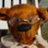
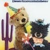 desertmountainbear
I really think your website is beautiful to look at, so feminine and elegant. I have already added your link to my page.
Hi Cheryl, I would love to swap links. I will go and add you to mine now. Great web site you have.
bingle bearsThanks, Joanne! I added your link as well! I did have to chuckle though at the thought of anything about me being feminine and elegant! I suppose there are times that I can be feminine and elegant, but my daily attire around the house tends to be jeans, a plain t-shirt (for unknown reasons I have an aversion to prints or logos), and crocs. I seem to live by the rule--"keep it simple." But I do like things to be beautiful--simple but beautiful!
Thanks, Lynn! I added you to my site as well. Your bears are very cute!
Heaps of Hugs,
Cheryl
 Back Road Bears
Cheryl - WOW!!!  Big changes from the first website! It's fun to "play" once you get familiar with what to do, isn't it? You've done a great job!
 Past Time Bears
:clap: :clap: :clap: :clap: :clap: 
Cheryl,
I love the new website. I would love to swap links with you. Here is a copy of my banner.
Do you have a banner you would like me to use?
Hugs,
bingle bearsThank you SO much, Dapne, Sue Ann, and Gijzette! I really feel like my site is on the right track!
Gijzette, I put your link on my site. You can copy the square banner on the entry page of my website or the rectangular banner from the Home page. Let me know if you have any trouble copying them and I can send you the photo.
Heaps of Hugs,
Cheryl
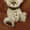
 Bear-Hands
Hi Cheryl
i really enjoyed looking at your site, the colours are beautiful and the layout is clear, i have already added you to my links page. your bears are so sweet such cute faces
hugs susan x
bingle bearsThank you so much, Susan! I couldn't find a banner to download from your site, so I hope you don't mind that I made a button using the photo of your cute little panda reading a book. I copied the photo and then added your name, "Bear-Hands," to the bottom. Please let me know if this is a problem. If you have a banner you would prefer for me to use for you link, just let me know.
Heaps of Hugs,
Cheryl