Banner Sponsors


For artists and collectors sponsored by Intercal...your mohair supplier and Johnna's Mohair Store
Hi all.
We talk quite a bit about websites and site design here at TEDDY TALK, so I thought it might be fun for us amateur-web-design-types (!) to gather together, in one place, those websites we know about, or stumble upon, that we think are just plain great.
Along with that, it might be instructive to write briefly about WHY we find these sites just plain fab.
My hope is that we can learn something new about constructing easy to use, easy to read, meaningful websites, to promote our own work on the web.
My fear is that all you warm-hearted people will feel compelled to praise each other's websites, in a "no TT'er left behind"-policy kind of way (!), which, while sweetly kindhearted, might prove kinda meaningless, and counter to what I envision here.
For that reason, I'm going to set the boundary that active participants at TT and their personal or teddy bear websites may NOT be included here for review.
However, sites DESIGNED BY TTer's for someone other than him or her self, are okay to post.
I'll start things off, below.
Let's have fun with this! There are a million absolutely fantastic websites on the internet, and whether we hope to design and build our own, or pay someone else to do it for us, we can learn a lot about presentation and color, simplicity and fun/excitement, and the important of consistency; branding; and establishing a business "identity"; if we take a minute to study what these sites have already done before us, paving our way!
Enjoy!
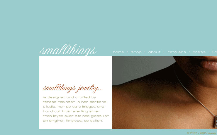
http://www.smallthingsdesigns.com/home.html
SMALLTHINGS DESIGNS
Teresa Robinson
Jewelry Designer
I love this site for its use of terrific, soothing color;
it's sheer simplicity, both aesthetifcally (it's very clean and un-cluttered looking) and functionally (it's incredibly easy to navigate);
and the way the font chosen (a script font) has a "flow" to it that feels organic, which mirrors the product being showcased -- jewelry centered around themes of nature.
I also love that you don't see a lot of "standard" web colors on this site, like black, gray, red, or dark (link-colored) blue.
And I'm particularly fond of the unnecessary, but delicate and exquisite!, design touch at the bottom of each page... the little "pods" (as the artist calls them in her jewelry descriptions) she's included. This reflects her attention to detail, which inspires me to look more closely at her jewelry, which I would assume receives that same focused attention to the "small things."
The clean use of white as her background color, and the way she places her jewelry against a white background, keeps a certain continuity between the text and image portions of her page.
Last, the fact that every one of her pages fits on a single monitor screen makes viewing the site easy on the wrists, since ZERO scrolling is required. Well... almost zero scrolling. She does have a few menus, if you want to read details about ordering, etc., that require a little flick of the wrist! But the photos are showcased entirely on a single monitor screen.
I love this one!
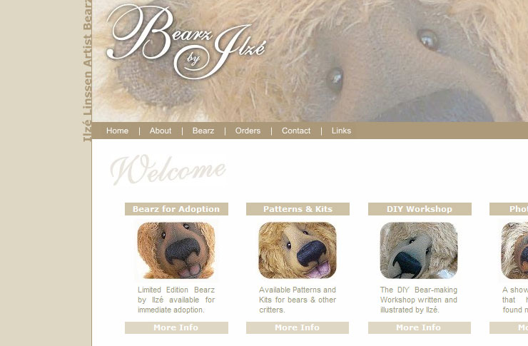
http://www.bearzbyilze.com.au/
Ilze Linssen
ARTIST BEARS BY ILZE LINSSEN
Teddy bear artist
Ilze is a fellow bear maker but hails from a computer science background, so she's working her left AND right brain! She designed and maintains her own site, and those of others; see Jane Perala's here: http://www.janeperalateddies.com/ I'm not sure she's taking new clients but you might think of looking to her for your design work if you're looking to have a site built.
I love the soothing neutrals used in both Ilze's and Jane's sites. The menus are easy to find AND to navigate. There's an interesting juxtaposition of straightforward typed-looking "text" and script fonts which imply handwritten detail, which adds a lot of interest to both these sites. They are both photo-rich without being overwhelmingly so. And check out the cool use of vertical text on the left border of Ilze's site!!!
Ilze's ordering page is one of the most straightforward, but detail- and content-rich, I've ever seen.
And I think her BEARZ>AWARDS AND MEDIA page is outstanding. It's a very compact, image-rich way to showcase all her published work on one monitor screen; and if you click on a given photo it enlarges to show greater detail.
I enjoy visiting immensely!
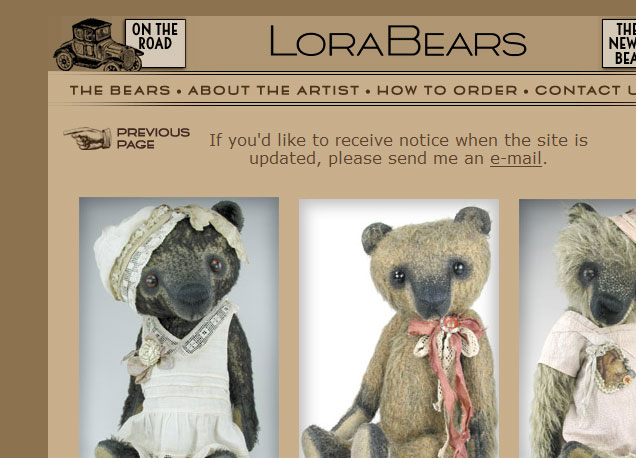
LORABEARS
Lora Soling
Teddy bear artist
Lora's is one of the first artist bear websites I visited, starting out, and I've always admired its clean look with vintage details; check out the little images of cars and buggies and clowns peppered on almost every page, which add interest and accent. And don't you just love that little pointing hand which leads you from page to page?
These elements -- clean, spare, modern overall look, combined with vintage clip art -- help establish Lora's "branding," or "identity," as an artist who makes bears in a somewhat modern way, but with a vintage, old-world feel.
It was not just the beauty and ease of Lora's site, but her understanding of the importance of "branding," that really first impressed me with her site. At that time, I was hearing earfulls from my great bestest friend, Andrea, a branding consultant and coach, about how important it is, especially starting out, to establish a look/feel/identity/brand that's consistent between your web presententation, your print presentation, and your product presentation. No sense using an antique font and selling modern bears. No sense using a clean graphic style and making Steiff reproductions. And so on. Lora represents herself in this way beautifully, with her product and website/presentation (modern, with a whimsical, vintage feel) matching one another just precisely.
Lora's site features photos that are consistently taken against a pale backdrop and then edited digitally to have a soft-focus grey, feathered edge. This helps one page blend seamlessly with the next, and allows her photos to be displayed side by side in a really pleasing way.
I think her ordering page is unique in that it's an entirely different color than the rest of her site. It says, "All business here!", rather than the fun and pleasure inherent in the rest of the pages.
Last, I just plain love visiting her site because I think she's fabulously talented and makes just the cutest, most unique bears. What a great inspiration!
Enjoy!
http://www.jmurphybears.com/
Jennifer Murphy
Teddy bear artist
Jennifer Murphy hails from a graphic design background and has a famous bearmaker for a mother, and this heritage spills out all over her incredibly unique website! It's filled with white space and hand-scribbled content, alongside those incredibly cute little critters she makes and sells like lightning.
Her site is incredibly fun to visit which meshes beautifully with her incredibly fun and whimsical creations. I get a sense of "Wheeeeee!" either looking at her little bears and bunnies, OR at her website. It's all just a fun-filled lark! Great branding!
Despite the flourishes and frills, her site is easy to navigate and there are no complicated menus or paths to follow.
Just a great, very unique, super fun place to visit, and get inspired!
 Posts: 3,177
My FAVOURITE website is.......................
da da da da daaaaaaaaaaa http://www.cloudappreciationsociety.org/index.html
and in case you were wondering............i AM a member 
That's a great site, Penny; looks very like a newspaper and is fun to read. Why do YOU like it so much???
Great topic Shelli - tee hee I was going to suggest Ilze's site but you beat me to it. I love love love her site...(and her bears).
As I spend most of my working day on the internet, I couldn't agree more with you about the minimum clicks, scrolling thing. All my examples of great design have gone out of my head. My own site doesn't live up to my principles - partly because of the limitations for design on my host and partly because of my lack html. I have a new plan roughed out on paper but have to find some time to put it into practice.
If you want an interesting experience wwwdontclick.it and try the mousecamp. I can guarantee you'll find yourself clicking out of habit!
Posts: 3,177I LOVE CLOUDS!!! 
Cloud watching is very relaxing and we get a LOT of cloud here in Blighty believe me, so i guess i thought i'd better get to like them
It's just such a great site to read too - lots of sites look great but really are'nt that interesting to read
I liked the part at the bottom of the HOME page, Penny, where it basically said, "Please write to us, but only about clouds, otherwise we don't care." Very funny and engaging... makes you want to read more and find out what the site is about.
The entire site is about a unique and intriguing idea, and they (wisely) make you LOOK FOR their "statement of purpose" which encourages lots of browsing. That, to me, makes it a REALLY great site. Whether about clouds or otherwise!
 Wild Thyme Originals
I KNOW that I am in the minority here.... but the sites I like..... the ones that I visit on a regular basis because I feel positively compelled to do so are fairly cluttered, have music, are not necessarily easy to navigate, etc..... essentially all the stuff that the majority of the world says... oh... you shouldn't do that! the link i am giving os for a site that used to carry a wide variety of flat out gorgeous artist dolls.... so that's why I initially started going there. Over the years they have shifted into publishing and selling prints and more mass produced figurines and such... things i that would probably never actually purchase.... but I go there, nearly every week to look watch the movie that you can click on on their home page..... gorgeous music... so if you go, turn your speakers on! I love the whole Pre-Raphelite / Froud / Alan Lee - ish style of the whole site... On the downside... some of the print is difficult to read... it seems too light , and when you click on the navigation things at the top of the site.... it pulls up other navigation links that appear in very light text right beneath... it kinda took me a while to even realize that was happening.... that I had to click on something ELSE after that first navigational click....
I guess I am really an escapist at heart... I like to see things that are different from my own reality...I like to feel inspired.... and this site really "does it for me!"
http://www.duirwaighgallery.com/index.php?section=5
That being said.... I absolutely understand the desireabilty of having a nice "clean" website... if I was going to design one or have one designed for myself.... i'd probably do something more along the lines of Jane Peralla's as far as the set up goes.....
I just kinda like the idea of being "transported" a bit.....
Kim Basta
Wild Thyme Originals
Still Web-Siteless!!!!!!!!
Kim, excellent choice, I think! Actually, you bring something important to the forefront...
"Clean" design does NOT necessarily = "Good" design. That was just a Shelli thing, which appealed to Shelli, in the particular few sites Shelli highlighted.
To complete the record... I also love the Duirwaigh Gallery website; haven't been there in a while, and it's even better than before, in terms of beauty! I'm a huge fan of cluttered, collage-y websites (have any of you visited my own???) and I, personally, don't remotely think that a website has to be "clean" or even "simple" to be good.
However, it's often times clutter and distracting elements that do, in fact, make a website "bad." Just visit WEB PAGES THAT SUCK sometime to get a look at what I mean. http://www.webpagesthatsuck.com/ I think it takes a special skill to make a very photo-rich, involved website that also highlights the product as equally as it highlights the pretty design stuff!
I think, maybe, it's harder to get a usable, functional, site when you start out thinking, "How can I gunk this up with lots of visuals and features?" It's probably better, when starting out, to think in flowchart terms: "What buttons/features do I need, and how can I simply showcase them?" And then, maybe, expand out from there.
But then, that's just one non-web-design-trained girl's amateur and personal opinion. :)
If you look at the Duirwaigh Gallery site, you'll notice that, amid all the sparkle and prettiness, there is a solid foundation of functionality and ease of use. The menu is easy to find and navigate. The "items for sale" is in a separate box with a solid background and each item is easy to locate visually; it's not mixed in amid the "clutter" of the beautiful background image. Even the Duirwaigh Gallery moniker is easy to separate out, visually, from the background image. There's no question where you are when you're there. It's spelled out quite clearly!
I do agree, however, that the print is in places hard to read. This could be an easy fix for someone who knows how, by changing the text color, font size, or the font used... or by adding a "glow" around words so they stand out more readily from the mottled, shaded background.
Alternatively, as Ilse did on her own website, the background image could be made more transparent (reduce the opacity), so that it's not as "strong" and therefore, interferes less with the text. The text is more important to the consemer/buyer than the background image; it's what leads them to click and browse and, hopefully, BUY!
I do have one question though... Are they not selling dolls at all any more, at all? Boo hoo.  I used to love viewing their doll art just like you, Kim; they had a fabulous selection of Judith & Lucia Friedericy work... some of my very favorite doll art in the world.
I feel like I am talking to myself. Shut up, Shel! :)
One more thing to check out, for the web-design-intrigued such as myself...
And one disclaimer to log, before I start: I don't really know what I'm talking about here. If someone else knows more, please, chime in.
In web design, one programs in a language. html. xhtml. ??? There is also this "thing" (precise terminology unknown to me) called CSS: Cascading Style Sheets.
Because I have no clue about how to code and design websites without my WYSIWYG (*What You See Is What You Get) html editor/site creator, I can't really define CSS for you.
I can tell you, in a nutshell, though, that my primitive cave-girl understanding of it is that CSS is a way you can "overlay" a certain "look" over existing html / xhtml CODE... thus, creating an endless variety of "looks" for your CONTENT, without having to re-create the content, with embedded visuals, every time you want to make a change.
Why on earth am I mentioning this here? Not because I expect any of us (or most of us, anyway) to understand it.
Rather, because there's this GREAT website, called CSS ZEN GARDEN, which does basically what I just explained. It takes a basic chunk of CODE, which you can read on the site's HOME page... and then invites web designers to create CSS to "overlay" onto that code...
... thus creating entirely new- and different-looking versions of its own website, using the very same CONTENT.
To get a better idea of what I'm talking about, just click here: http://www.csszengarden.com/?cssfile=/0 … css&page=1
The first page is the basic site... and then, to the right, is a list of designer-submitted CSS versions of the very same basic content.
Be sure to click on the "title" or "name" of the version, and not on the designer's name, to see what I mean.
I thought this an interesting way to view a huge variety of "takes", from different artists, with unique visions, on the very same basic content.
Some of my favorites, below. Do note that every last word on each of these pages, below, is precisely and exactly the same; it's only the visuals, the arrangement, the way things are colored or highlighted or made to "look," that's different:
http://csszengarden.com/?cssfile=http:/ … sample.css
http://www.csszengarden.com/?cssfile=/1 … css&page=1
http://www.csszengarden.com/?cssfile=/1 … css&page=2
http://www.csszengarden.com/?cssfile=/1 … css&page=3
http://www.csszengarden.com/?cssfile=/1 … css&page=5
http://www.csszengarden.com/?cssfile=/1 … css&page=6
http://www.csszengarden.com/?cssfile=/1 … css&page=6
http://csszengarden.com/?cssfile=http:/ … /style.css
http://csszengarden.com/?cssfile=/088/088.css -- (a "horizontal" design!)
http://csszengarden.com/?cssfile=/017/017.css
Have fun!
Posts: 3,177OMG Shelli - i'm still battling with html!!!!!!!
Help - don't get me started on CSS too. 


Wild Thyme OriginalsI do have one question though... Are they not selling dolls at all any more, at all? Boo hoo.
Yes... shelli..... sadly they did move away from artist dolls.....They do have a few dolls showcased on a "sculpture" page..... but that's it... They really did move their direction away from ooak fantasy themed dolls for SURE! I love Friedericy dolls too Shelli! 
Kim Basta
Wild Thyme Originals
 Flying Fur Studios
Shelli, really. YOu are just too funny for me! LOL
Interesting though, thanks. Gives me some motivation to FINALLY start my website. If only I could pick a name...................
Also some fun stuff to check out while I"m at work tomorrow.
Also some fun stuff to check out while I"m at work tomorrow.
HAHAHA!

 Apple Dumpling Designs
I feel like I am talking to myself. Shut up, Shel! :)
It's okay Shelli...some of us just listen without speaking. You know...children should be seen not heard...that's me.
Actually, this thread is very helpful to me right now because I'm exploring other websites as inspiration for my own site. A friend is going to do it for me since I just CAN'T. I gave up...I'd rather play with fur, stuffing, little eyeballs, etc.
Thanks!!!
Shantell
 Sheila Leigh
I love all of ILZE LINSSEN's websites. I like the clean look and the *warm fuzzy* feel of the websites that she has created. I contacted her a year ago because I wanted my website designed. Then I decided to try to create my website myself, but I'm not very good with website designs. I wish I was!! I had a 7-day free trial of coffeecup visualsite designer, I loved it. But my trial ran out and I haven't bought the program yet.
Shelli, I really like "smallthings" website with the jewelry. I would love to have a website with that type of look. But then again, I love Jennifer Murphy's site. I've never been to her site before, and I just love the way it looks. See this is my problem!! I love all of these sites, how can I decide what's best for my type of bears???
bear hugs,
Sheila
 Newcastle, Ontario
I love this - I know what I like but have no idea about what's "good or not" to have for a web site. I only know that I can't tolerate music while I'm on a site. Nothing will make me click off faster than hearing music, which is odd, as I really love music. I've no idea why it bothers me so much.
So Kim, I went to http://www.duirwaighgallery.com/index.php?section=5 and I love it - it's beautiful. I love Brian Froud's art and the fairy coins were really neat and all the busy- ness is fine - I just turned off the volume before I went.
Hugs,
Brenda
 Matilda Huggington-beare
DUIRWAIGH is wonderful Kim!!! Now thats what I call a website. Its like going into another world. Its like being cocooned in a gentle fantasy.
Wendy 
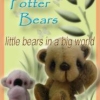 Pandy Potter Bears
What a fantastic topic. I am thinking about design to do a new website. I'm getting there but this has been great. Its given me an insight in what works for people. Its good to get ideas about what collectors/makers like to see. Thanks! :dance: Now back to having another read and look at everyones links!
Posts: 3,177I have been toying with re-doing my website for a while now - i like to keep it new and fresh so that visitors don't get bored and this topic has got me all geared up to get it done.
Shelli - it's all YOUR FAULT!!!!!! 
Penny :hug:
 Chowlea Bears
Oh good lord - yet another thing I can't do ......................... :doh:
Sandra :redface:
 Back Road Bears
Shelli - it's all YOUR FAULT!!!!!!
Penny :hug:
Ditto!
WHEN I have time I want to totally re-do my site.... planned on it anyway... but now I'm really itching to do it! After touring many of the sites Ilze has done I'm so inspired!!! I like some of her earlier site designs. Her own bear website is beautiful! Of couse I have one little problem.... how in the world to do it!?!?!?! Front Page is sooo limiting! No, I'm not looking for technical advice.... we've been there, done that! I'm just so in awe of some of these sites!
Thanks for lighting a match under my behind, Shel!!!